Contents
As a data analyst, one of the most important skills you can have is the ability to present data effectively. No matter how insightful your data is, it won’t be useful unless you can convey it clearly. This is where data visualization tools come in. These tools help turn complex data sets into easy-to-understand visuals that allow for better decision-making. In this article, we’ll walk you through the top 8 data visualization tools every data analyst should know in 2026.
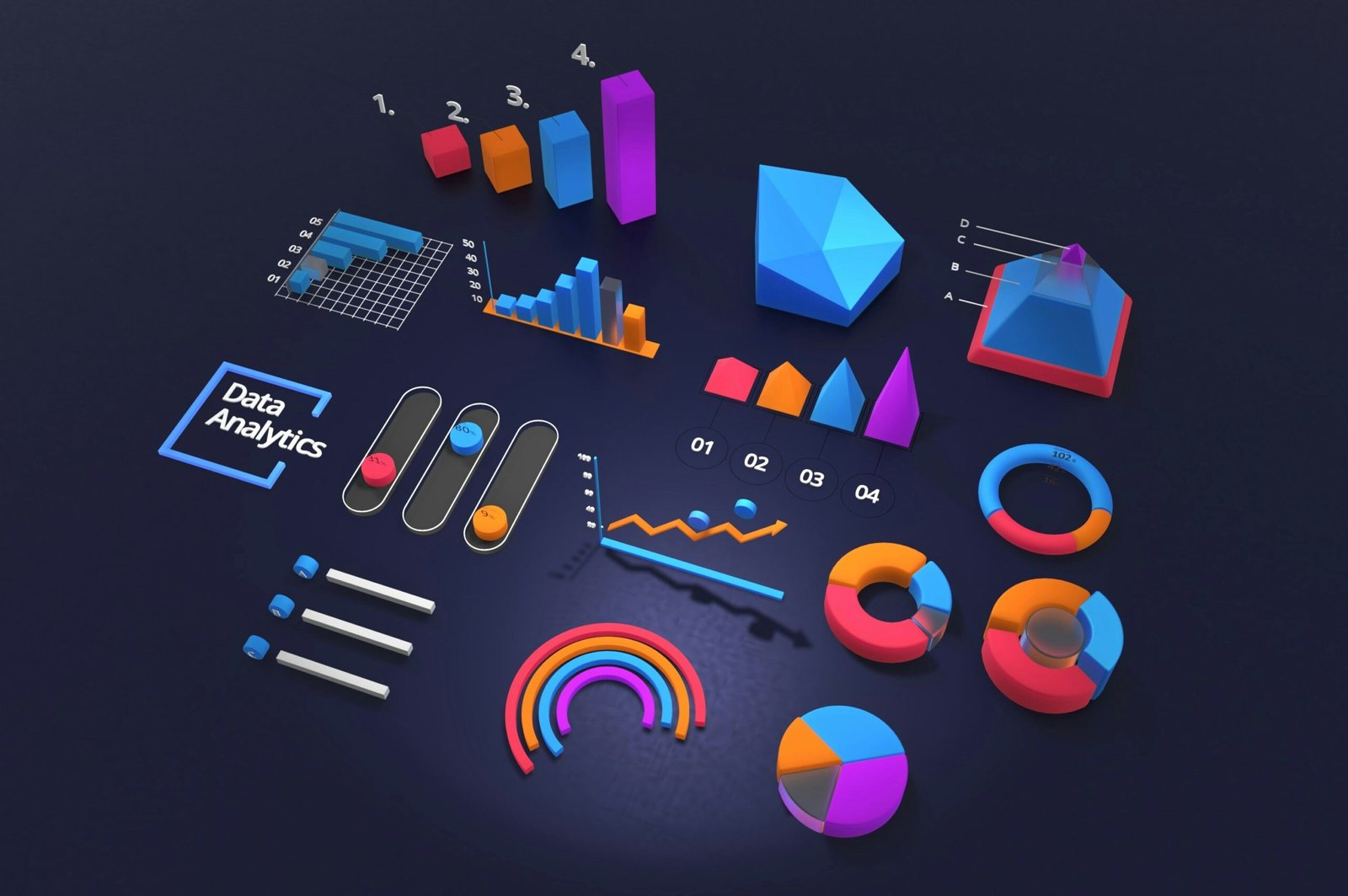
What is Data Visualization?

Data visualization is the graphical representation of data. It involves creating charts, graphs, and other visual tools to help analyze and communicate data insights. Good data visualization makes it easier to understand trends, patterns, and outliers in data. By using the right tools, data analysts can turn raw data into meaningful stories that drive smarter business decisions.
Key Takeaway:
Data visualization is critical for any data analyst. The right tool helps you communicate complex data insights quickly and clearly. Whether you’re making business decisions or explaining findings, a great visualization tool can make all the difference.
1. Tableau
Tableau is one of the most popular data visualization tools. Known for its powerful features and interactive dashboards, it allows data analysts to transform raw data into interactive visual reports with ease.
Key Features:
-
Powerful data visualization platform.
-
Supports interactive dashboards.
-
Works with multiple data sources (Excel, Google Analytics, SQL, etc.).
Pros:
-
Drag-and-drop interface makes it easy to use.
-
Provides real-time data updates.
-
Robust community support and tutorials.
Cons:
-
High learning curve for beginners.
-
Expensive for small businesses.
Best For: Data analysts who need interactive dashboards and real-time visualizations.
2. Power BI
Power BI, developed by Microsoft, is a business intelligence tool that allows data analysts to create and share reports and dashboards. It’s known for its integration with Microsoft tools and its cost-effective pricing.
Key Features:
-
Integrated with Microsoft products.
-
Provides real-time dashboards.
-
Offers cloud-based services for easy sharing and collaboration.
Pros:
-
User-friendly interface.
-
Affordable for small businesses.
-
Strong integration with other Microsoft tools like Excel.
Cons:
-
Limited customization options compared to Tableau.
-
Some features are complex for beginners.
Best For: Businesses already using Microsoft tools looking for a budget-friendly solution.
3. Google Data Studio
Google Data Studio is a free tool that allows you to create custom reports and dashboards. It’s perfect for teams already using Google Analytics, as it integrates seamlessly with other Google products.
Key Features:
-
Completely free to use.
-
Seamless integration with Google Analytics and other Google products.
-
Customizable templates and design options.
Pros:
-
Easy to use with a simple interface.
-
Real-time data collaboration.
-
Great for marketing and SEO data visualization.
Cons:
-
Limited support for non-Google products.
-
Can be slow with large data sets.
Best For: Small businesses and marketing teams who use Google Analytics.
4. Qlik Sense
Qlik Sense offers advanced analytics and self-service data visualization tools. It uses AI-driven insights and recommendations to help analysts explore data more deeply and make data-driven decisions.
Key Features:
-
Self-service data visualization and analysis.
-
AI-driven insights and recommendations.
-
Supports a wide range of data sources.
Pros:
-
Offers in-depth data exploration.
-
Powerful AI features for generating insights.
-
Flexible data integration options.
Cons:
-
Can be overwhelming for beginners.
-
Pricing can be high for small teams.
Best For: Advanced data analysts who need in-depth insights and AI-driven recommendations.
5. D3.js
D3.js is an open-source JavaScript library that gives developers the tools to create custom interactive data visualizations. It’s ideal for those who want to build data-driven graphics on the web with full flexibility.
Key Features:
-
A JavaScript library for creating interactive visualizations.
-
Customizable data-driven graphics.
-
Suitable for web-based visualizations.
Pros:
-
Highly flexible and customizable.
-
Ideal for building complex and interactive visualizations.
-
Open-source and free to use.
Cons:
-
Requires coding knowledge.
-
Steep learning curve.
Best For: Developers and analysts who want to create custom, interactive visualizations on the web.
6. Looker
Looker is a powerful business intelligence tool that focuses on data exploration. It provides tools for creating and sharing reports, offering deep insights and visualizations for enterprises and larger organizations.
Key Features:
-
Business intelligence tool that specializes in data exploration.
-
Allows users to create and share reports and dashboards.
-
Data modeling and analysis for better insights.
Pros:
-
Strong collaboration features.
-
Scalable and suitable for enterprises.
-
Integration with various data sources.
Cons:
-
Pricing is on the higher end.
-
Steep learning curve for beginners.
Best For: Enterprises and large businesses requiring extensive reporting and data analysis tools.
7. Zoho Analytics
Zoho Analytics is a cloud-based data visualization tool that’s easy to use and integrates with over 250 data sources. It offers AI-powered insights to help businesses understand their data in new ways.
Key Features:
-
Cloud-based data visualization tool.
-
Integrates with over 250 data sources.
-
Offers AI-powered data insights.
Pros:
-
Affordable and scalable for small businesses.
-
Easy drag-and-drop interface.
-
Good customer support.
Cons:
-
Some advanced features are only available in higher-tier plans.
-
Limited customization options compared to Tableau or Power BI.
Best For: Small businesses looking for an affordable data analytics solution.
8. Plotly
Plotly is an open-source tool known for creating interactive data visualizations. It supports a variety of data types and is great for those in technical fields like scientific data analysis.
Key Features:
-
Open-source tool for creating interactive visualizations.
-
Integrates with Python, R, and JavaScript.
-
Excellent for scientific and statistical data analysis.
Pros:
-
Highly interactive and customizable.
-
Great for technical users with coding knowledge.
-
Supports 3D visualizations.
Cons:
-
Requires technical skills (coding).
-
Limited features in the free version.
Best For: Data analysts who need to work with scientific or complex data.
Comparison Table: Best Data Visualization Tools
| Tool | Price | Best For | Ease of Use | Key Features |
|---|---|---|---|---|
| Tableau | Expensive | Interactive dashboards, big data analysis | High | Drag-and-drop, multiple data sources |
| Power BI | Affordable | Microsoft users, small businesses | Moderate | Integration with Microsoft tools |
| Google Data Studio | Free | Small businesses, Google Analytics users | Easy | Real-time collaboration, Google products |
| Qlik Sense | Expensive | Advanced analysts, AI-driven insights | High | AI-powered insights, in-depth analysis |
| D3.js | Free | Developers, custom web visualizations | Advanced | Highly customizable, coding required |
| Looker | Expensive | Large businesses, extensive reporting | High | Data modeling, strong reporting tools |
| Zoho Analytics | Affordable | Small businesses, cloud-based solutions | Easy | Drag-and-drop, AI-powered insights |
| Plotly | Free | Technical users, complex scientific data | Advanced | Interactive, supports 3D visualizations |
How to Choose the Right Data Visualization Tool?
When selecting a data visualization tool, consider the following factors:
-
Budget: Some tools are free, while others can be expensive. Make sure you choose one that fits your budget.
-
Ease of Use: If you’re new to data visualization, go for tools that are easy to use, like Power BI or Google Data Studio.
-
Features: Make sure the tool you choose has the features you need, such as real-time collaboration, AI insights, or integration with other platforms.
-
Customization: If you need to build highly customized visualizations, tools like D3.js and Plotly may be more suitable.
Key Takeaway:
There are numerous data visualization tools available, each offering unique features and capabilities. The best tool for you depends on your business needs, skill level, and budget. Whether you’re an advanced user needing deep insights or a beginner seeking a simple solution, there’s a tool that fits your requirements.
Read More:
FAQs
1. What is the best data visualization tool for beginners?
Tools like Google Data Studio and Power BI are perfect for beginners due to their user-friendly interfaces and helpful tutorials.
2. Can I use these tools for real-time data analysis?
Yes, tools like Tableau and Power BI offer real-time data analysis and dashboards.
3. Are these tools compatible with other data sources?
Most of the tools mentioned support multiple data sources, such as Excel, Google Analytics, SQL databases, and more.
4. Which tool is best for businesses with large teams?
Looker and Tableau are ideal for large businesses that require extensive reporting and data collaboration.
5. Is there any free data visualization tool?
Yes, Google Data Studio and Plotly offer free versions, although with some limitations compared to paid versions.
Conclusion
With so many options to choose from, selecting the best data visualization tool can be a challenge. However, the right tool can help you present data in a clear, compelling way, leading to better business decisions and insights. Whether you’re just starting out or you’re an experienced data analyst, these 8 tools can help take your data visualization skills to the next level.
For more tech insights, explore other guides on our site: Ask Me Bazaar.